 hsrambo07
Hover Effects TS
A collection of beautiful hover effects for images using canvas. Built with TypeScript and optimized for performance.
📺 Live Demos
Video Demo
Click the image to view the demo video on YouTube
Interactive Playground
Check out our live demo to see all the effects in action:
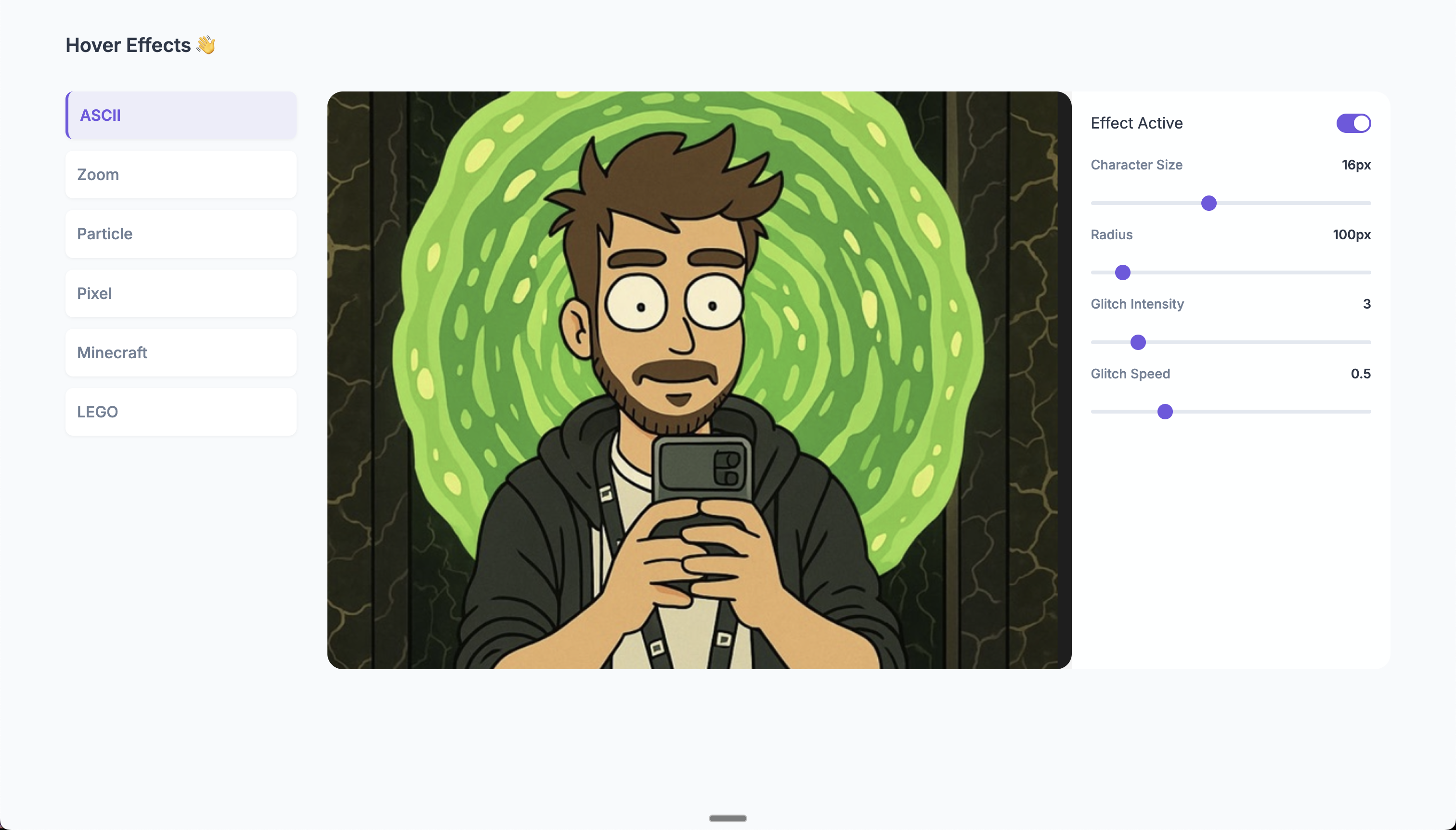
You can quickly figure out what values works best and directly plug those in your implementation :D.
✨ Features
- 🖼️ Multiple Effects: Choose from ASCII art, zoom, particle dust, pixel art, Minecraft-style, Lego, and LED Matrix effects
- 🎨 Canvas-based: Smooth, performant animations using the Canvas API
- 📱 Responsive: Works with any image size
- 🎮 Interactive: Dynamic effects that respond to mouse movement
- 🔧 Customizable: Configure effect parameters in real-time
- 🚀 Lightweight: Minimal dependencies, focused on performance
- 📦 Tree-shakable: Only import the effects you need
📥 Installation
# Using npm
npm install hover-effects-ts

# Using yarn
yarn add hover-effects-ts

# Using pnpm
pnpm add hover-effects-ts
🚀 Quick Start Guide
Basic Example
Add the effect to your image with just a few lines of code:
<img src="your-image.jpg" alt="Your Image" id="my-image">

<script type="module">
  import { applyHoverEffect } from 'hover-effects-ts';

  // Get your image element
  const image = document.getElementById('my-image');

  // Apply a cool ASCII effect
  applyHoverEffect(image, {
    effect: 'ascii',
    size: 16,
    radius: 100
  });
</script>
Multiple Images
You can easily apply effects to multiple images at once:
// Select all images with a specific class
const images = document.querySelectorAll('.hover-image');

// Apply the same effect to all of them
applyHoverEffect(images, {
  effect: 'zoom',
  scale: 1.2,
  radius: 100
});
Using CSS Selector
You can also target elements using a CSS selector:
// Apply effect to all images with a specific class
applyHoverEffect('.gallery-image', {
  effect: 'minecraft',
  blockSize: 8,
  radius: 130
});
📚 Example Usage Guide
For a comprehensive guide on using hover effects correctly, check out the examples directory, which includes:
Interactive Usage Guide - A complete example showing proper initialization and configuration:
examples/usage-guide.html- Interactive demo with UI controlsexamples/usage-guide.js- Implementation with best practices
Key Implementation Patterns:
- Waiting for images to load before applying effects
- Using UI control values for initialization
- Properly updating effects with setter methods
- Debugging and troubleshooting techniques
Run the examples locally after installing:
# Clone the repository
git clone https://github.com/hsrambo07/hover-effects
cd hover-effects

# Install dependencies
npm install

# Build the library
npm run build

# Open the example in your browser
open examples/usage-guide.html
📦 Import Only What You Need
To reduce your bundle size, you can import only the specific effects you need:
// Import only the effects you'll use
import { AsciiHover } from 'hover-effects-ts';

// Create the effect directly
const effect = new AsciiHover({
  size: 16,
  radius: 100
});

// Attach it to your image
effect.attach(document.querySelector('img'));

// Clean up when done
effect.destroy();
🎮 Interactive Controls
All effects support dynamic parameter updates:
// Create an effect
const effect = applyHoverEffect('#my-image', {
  effect: 'ascii',
  size: 16,
  radius: 100
});

// Connect to UI sliders
document.getElementById('size-slider').addEventListener('input', (e) => {
  effect.setSize(parseInt(e.target.value));
});

document.getElementById('radius-slider').addEventListener('input', (e) => {
  effect.setRadius(parseInt(e.target.value));
});
🎨 Available Effects
ASCII Art Effect
Transforms your image into dynamic ASCII characters when hovering.
📺 Demo: See the ASCII effect in action on YouTube
applyHoverEffect('#my-image', {
  effect: 'ascii',
  size: 16,              // Character size in pixels (range: 6-30, default: 16)
  radius: 100,           // Effect radius in pixels (range: 30-800, default: 100)
  glitchIntensity: 3,    // Intensity of the glitch effect (range: 0-20, default: 3)
  glitchSpeed: 0.5,      // Speed of the glitch effect (range: 0.1-20, default: 5)
  chars: ['█', '@', '%', '#', '*', '+', '=', '-', ':', '.', ' '] // Optional custom characters
});
Available controls:
setSize(size)- Changes the character size (6-30px)setRadius(radius)- Changes the effect radius (30-800px)setGlitchIntensity(intensity)- Adjusts glitch intensity (0-20)setGlitchSpeed(speed)- Adjusts glitch animation speed (0.1-20)setChars(chars)- Sets custom character set
Zoom Effect
Creates a magnifying glass effect when hovering.
📺 Demo: See the zoom effect in action on YouTube
applyHoverEffect('#my-image', {
  effect: 'zoom',
  scale: 1.2,    // Zoom scale (range: 1.1-2.0, default: 1.2)
  radius: 100    // Effect radius in pixels (range: 50-200, default: 100)
});
Available controls:
setScale(scale)- Changes the zoom magnification level (1.1-2.0)setRadius(radius)- Changes the zoom lens radius (50-200px)
Particle Dust Effect
Breaks the image into pixel particles that scatter when hovering.
📺 Demo: See the particle effect in action on YouTube
applyHoverEffect('#my-image', {
  effect: 'particle-dust',
  spacing: 4,     // Particle spacing in pixels (range: 2-10, default: 4)
  maxDrift: 28,   // Maximum particle drift distance (range: 10-50, default: 28)
  radius: 110     // Effect radius in pixels (range: 50-200, default: 110)
});
Available controls:
setSpacing(spacing)- Changes particle density (2-10px)setMaxDrift(maxDrift)- Adjusts how far particles drift (10-50px)setRadius(radius)- Changes the effect radius (50-200px)
Pixel Effect
Creates a pixelated effect when hovering.
📺 Demo: See the pixel effect in action on YouTube
applyHoverEffect('#my-image', {
  effect: 'pixel',
  blockSize: 16,   // Pixel size in pixels (range: 4-32, default: 16)
  radius: 130     // Effect radius in pixels (range: 50-200, default: 130)
});
Available controls:
setBlockSize(blockSize)- Changes the pixel size (4-32px)setRadius(radius)- Changes the effect radius (50-200px)
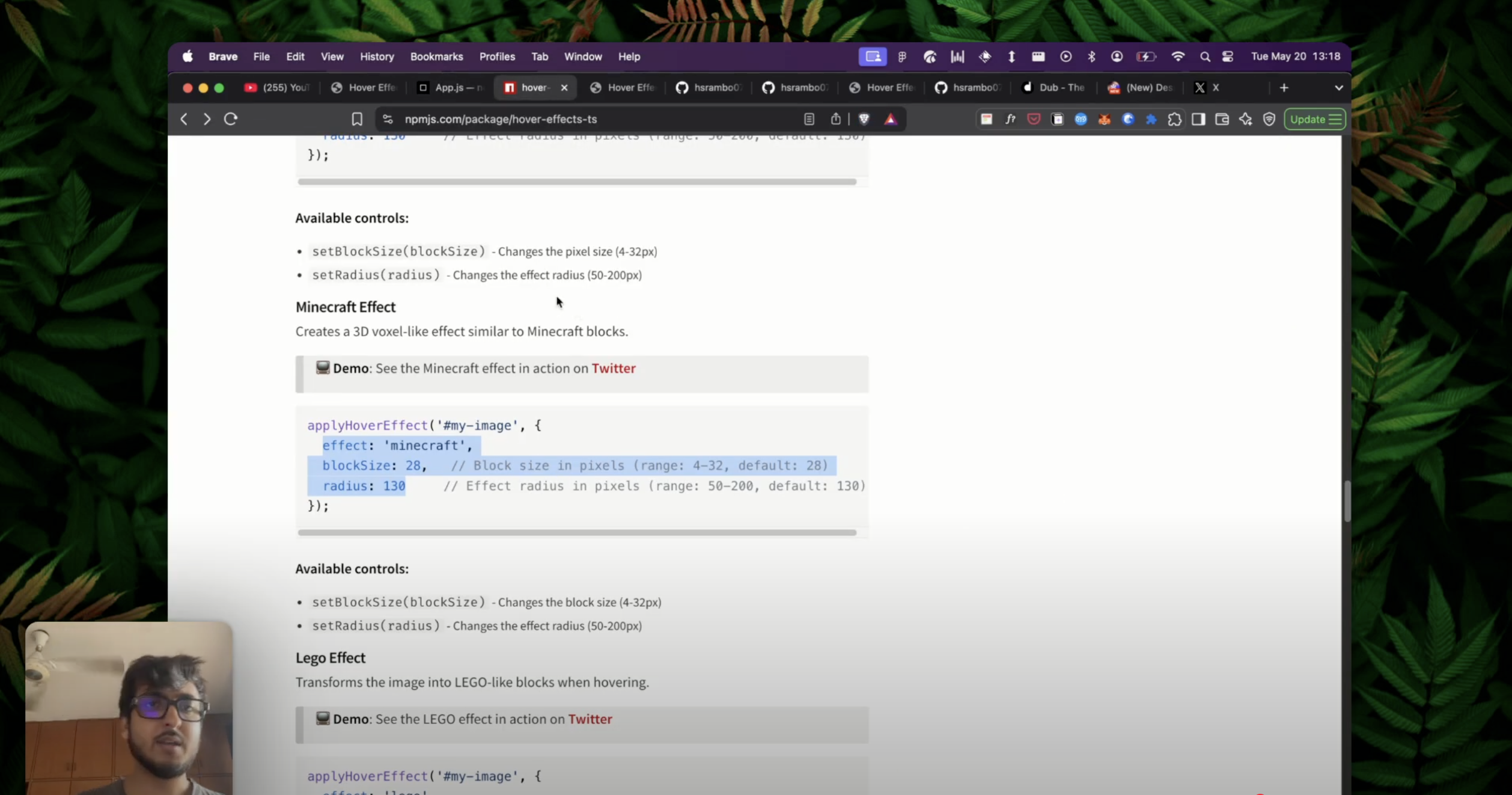
Minecraft Effect
Creates a 3D voxel-like effect similar to Minecraft blocks.
📺 Demo: See the Minecraft effect in action on YouTube
applyHoverEffect('#my-image', {
  effect: 'minecraft',
  blockSize: 28,   // Block size in pixels (range: 4-32, default: 28)
  radius: 130     // Effect radius in pixels (range: 50-200, default: 130)
});
Available controls:
setBlockSize(blockSize)- Changes the block size (4-32px)setRadius(radius)- Changes the effect radius (50-200px)
Lego Effect
Transforms the image into LEGO-like blocks when hovering.
📺 Demo: See the LEGO effect in action on YouTube
applyHoverEffect('#my-image', {
  effect: 'lego',
  blockSize: 16,   // Lego brick size in pixels (range: 8-40, default: 16)
  radius: 140,     // Effect radius in pixels (range: 80-200, default: 140)
  gap: 2,          // Gap between bricks (range: 1-5, default: 2)
  studScale: 0.33, // Scale of the studs on top of bricks (range: 0.2-0.7, default: 0.33)
  depth: 0.25,     // 3D effect depth (range: 0.1-0.4, default: 0.25)
  softEdge: 90,    // Softness of edge transition (range: 30-150, default: 90)
  fadeExp: 1.4     // Fade exponent for smooth transitions (range: 1.0-3.0, default: 1.4)
});
Available controls:
setBlockSize(blockSize)- Changes the brick size (8-40px)setRadius(radius)- Changes the effect radius (80-200px)setGap(gap)- Adjusts spacing between bricks (1-5px)setStudScale(scale)- Changes the stud size on top of bricks (0.2-0.7)setDepth(depth)- Adjusts the 3D depth effect (0.1-0.4)setSoftEdge(edge)- Controls the edge softness (30-150px)setFadeExp(exp)- Adjusts the fade exponent for transitions (1.0-3.0)
LED Matrix Effect
Creates an authentic LED matrix display that replaces the image with animated LED dots when hovering.
📺 Demo: See the LED Matrix effect in action on YouTube
applyHoverEffect('#my-image', {
  effect: 'dot-matrix',
  radius: 120,              // Effect radius in pixels (range: 50-300, default: 120)
  ledSize: 4,               // LED dot size in pixels (range: 2-15, default: 4)
  ledSpacing: 5,            // Spacing between LEDs (range: 4-25, default: 5)
  softEdge: 20,             // Soft edge transition (range: 0-50, default: 20)
  fadeExp: 2.0,             // Fade exponent for smooth transitions (range: 0.5-5.0, default: 2.0)
  glow: true,               // Enable LED glow effect (default: true)
  colorMode: 'mono',        // Color mode: 'mono' (cyan) or 'rgb' (original colors)
  animationType: 'wave',    // Animation type: 'none', 'wave', 'pulse', 'drift', 'ripple', 'rotation'
  animationSpeed: 1.0,      // Animation speed multiplier (range: 0.1-5.0, default: 1.0)
  animationIntensity: 3.0   // Animation intensity (range: 0.1-10.0, default: 3.0)
});
Available controls:
setRadius(radius)- Changes the effect radius (50-300px)setLedSize(ledSize)- Changes the LED dot size (2-15px)setLedSpacing(ledSpacing)- Adjusts spacing between LEDs (4-25px)setSoftEdge(softEdge)- Controls the edge softness (0-50px)setFadeExp(fadeExp)- Adjusts the fade exponent (0.5-5.0)setGlow(glow)- Toggles the LED glow effect (boolean)setColorMode(colorMode)- Switches between 'mono' and 'rgb' color modessetAnimationType(animationType)- Changes animation type ('none', 'wave', 'pulse', 'drift', 'ripple', 'rotation')setAnimationSpeed(animationSpeed)- Adjusts animation speed (0.1-5.0)setAnimationIntensity(animationIntensity)- Controls animation intensity (0.1-10.0)
Animation Types:
- Wave: LEDs move in smooth sine wave patterns
- Pulse: LEDs pulse in size and brightness with varying phases
- Drift: LEDs drift randomly like particles in space
- Ripple: Ripple effects emanate from the mouse position
- Rotation: LEDs rotate around their positions with varying speeds
- None: Static LED display without animation
🚀 Performance Tips
To keep your hover effects running smoothly:
- Image Size: Use appropriately sized images. Very large images may impact performance.
- Effect Parameters:
- For ASCII effect, larger character sizes improve performance
- For Particle effect, larger spacing values reduce the number of particles
- For Pixel/Minecraft effects, larger block sizes improve performance
- Radius: Smaller effect radii generally perform better
- Clean Up: Always call
destroy()when removing effects to prevent memory leaks
🔧 Best Practices
Initialization
For best results when initializing effects:
Load Images First: Ensure images are fully loaded before applying effects
const img = document.getElementById('my-image');
img.onload = () => {
  const effect = applyHoverEffect(img, { effect: 'minecraft', blockSize: 28 });
};
Get UI Controls Values: If using sliders or other UI controls, initialize with their actual values
const sizeSlider = document.getElementById('size-slider');
const radiusSlider = document.getElementById('radius-slider');

const effect = applyHoverEffect('#my-image', {
  effect: 'pixel',
  blockSize: parseInt(sizeSlider.value),
  radius: parseInt(radiusSlider.value)
});
Safely Update Effects: Use setter methods for real-time updates without re-initialization
// Better than destroying and recreating the effect
sizeSlider.addEventListener('input', (e) => {
  effect.setBlockSize(parseInt(e.target.value));
});
Debugging Tips
If you encounter issues with effects:
- Check Browser Console: Enable console logging for detailed initialization info
- Monitor Effect State: Create a debug button to log the internal state
const debugBtn = document.getElementById('debug-btn'); debugBtn.addEventListener('click', () => { console.log('Effect state:', { blockSize: effect.getBlockSize?.() || 'N/A', radius: effect.getRadius?.() || 'N/A', samples: effect._getSamples?.()?.length || 'N/A' }); }); - Canvas Inspection: Use browser dev tools to examine the canvas element and its properties
🌐 Browser Support
The library is supported in all modern browsers:
- ✅ Chrome 60+
- ✅ Firefox 55+
- ✅ Safari 11+
- ✅ Edge 79+
🧪 Integration Examples
Using with React
import React, { useEffect, useRef } from 'react';
import { applyHoverEffect } from 'hover-effects-ts';

function HoverImage({ src, alt, effect }) {
  const imgRef = useRef(null);
  const effectRef = useRef(null);

  useEffect(() => {
    if (imgRef.current) {
      // Apply the effect
      effectRef.current = applyHoverEffect(imgRef.current, effect);

      // Clean up on unmount
      return () => {
        if (effectRef.current) {
          effectRef.current.destroy();
        }
      };
    }
  }, [effect]);

  return <img ref={imgRef} src={src} alt={alt} />;
}

// Usage
function App() {
  return (
    <HoverImage
      src="/your-image.jpg"
      alt="Interactive Image"
      effect={{
        effect: 'ascii',
        size: 16,
        radius: 100
      }}
    />
  );
}
📄 License
MIT License - feel free to use this in your projects!
📝 Changelog
Version 2.5.1
- IMPROVEMENT: Updated LED Matrix default values for better visual density
- CHANGE: Default LED size reduced from 8px to 4px
- CHANGE: Default LED spacing reduced from 8px to 5px
- UPDATE: Updated playground controls and documentation to reflect new defaults
Version 2.5.0
- NEW: Added LED Matrix effect with authentic LED display simulation
- NEW: LED Matrix supports both monochrome (cyan) and RGB color modes
- NEW: Added 6 animation types for LED Matrix: Wave, Pulse, Drift, Ripple, Rotation, and None
- NEW: Configurable LED size, spacing, glow effects, and animation parameters
- NEW: Real-time animation controls with speed and intensity adjustments
- ENHANCEMENT: Improved canvas dimension validation to prevent IndexSizeError
- ENHANCEMENT: Added fallback handling for image loading edge cases
- ENHANCEMENT: Enhanced type definitions for better TypeScript support
Version 2.4.4
- Added proper `